|
BIKEX Graphics | Closed
|
| Bikex |
Posted on 05-01-2013 20:38
|
Team Leader

Posts: 7418
Joined: 25-08-2012
PCM$: 600.00
|
| - Jerseys, Minijerseys | | - Team Equipment | | - Team Acessoirs | | - Anything Graphical |
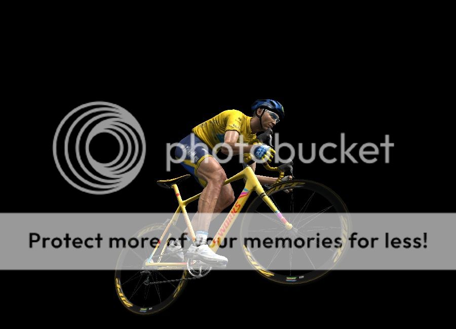
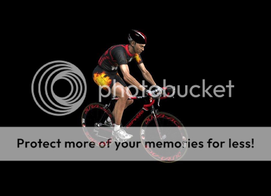
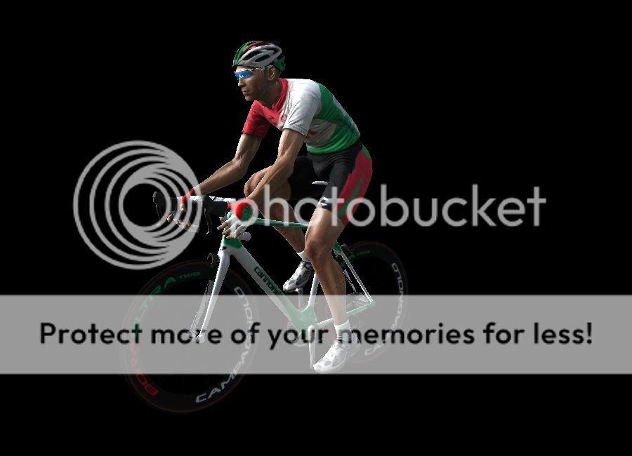
Jerseys
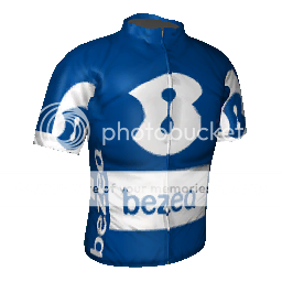
 Bezeq Bezeq
Spoiler
 Israel
Netherlands
 Bruxelles Bruxelles
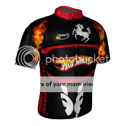
 Hotwheels - Porsche Hotwheels - Porsche
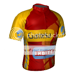
 Gamesa-Inditex Gamesa-Inditex
Spoiler
Belgium
Spain
France
[img][/img]
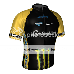
 Lamborghini - Monster Lamborghini - Monster
Spoiler
Australia
Spain
Great Britain
Italy
United States
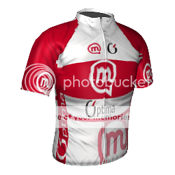
 Mobitel - Optima Mobitel - Optima
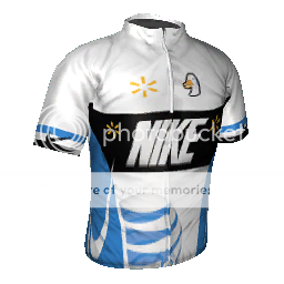
Nike - AT&T
Spoiler
Argentinia
Canada
Estonia
France
Great Britain
Mexico
Russia
Slovakia
Slovenia
United States
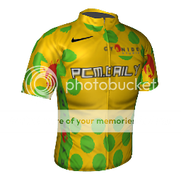
 PCM.Daily PCM.Daily
Spoiler
Belgium
Spain
Germany
Slovakia
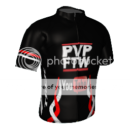
PVP-Youtube
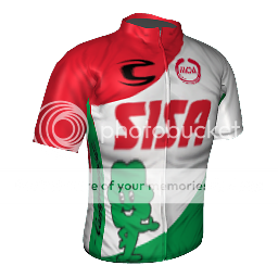
Sisa
Spoiler
Australia
Belgium
Spain
France
Germany
Italy
Netherlands
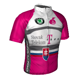
 Slovak Telekom Slovak Telekom
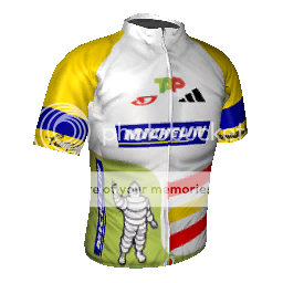
TAP-Michelin
Spoiler
Portugal
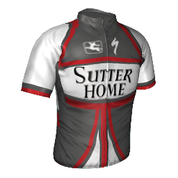
Sutter Home
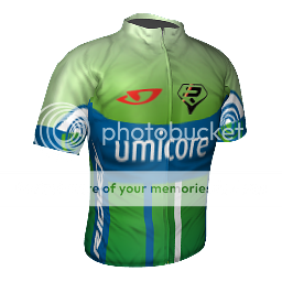
Umicore
Spoiler
Belgium
France
Netherlands
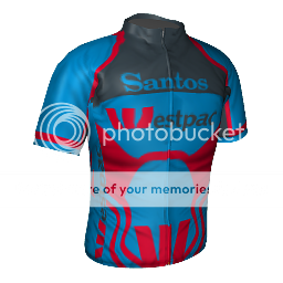
 Westpac-Santos Westpac-Santos
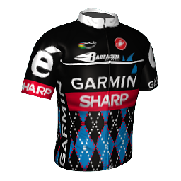
Garmin - Sharp
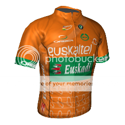
Euskaltel - Euskadi
Equipment
Contadors Tour de France Bike
Hotwheels Roadracebike
Hotwheels Timetrialbike
Sisa Roadraceset
Sisa Timetrialset
Team Type One Set of Wheels

Original Post:
Spoiler I was bored so I made jerseys for my PCM Game. I dont think they are really good but I now decided to upload them and maybe get tips how to do better and what is already good...
My jerseys:
[spoiler]
Aeroflot Cycling Team
Team Stiegl-Adidas
Team O2
Tim Hortons Professional Cycling Team
Edited by Bikex on 07-04-2013 09:04
|
| |
|
|
| jordynoel789 |
Posted on 05-01-2013 21:01
|

Neo-Pro

Posts: 350
Joined: 08-04-2012
PCM$: 200.00
|
i not bad
wich program do u use
some tips
jersey1: use a template like in the last 2 jerseys the blue around the neck sucks ( use a shape to color that
jersey 2  retty nice again the plis retty nice again the plis
jersey3:your logo's are pixelated this is probaly from coloring them (if you use gimp i advice to use the color changer wich can be found in the color section the tird icon)
jersey4 : nothing bad to say about it |
| |
|
|
| Bikex |
Posted on 05-01-2013 21:42
|
Team Leader
Posts: 7418
Joined: 25-08-2012
PCM$: 600.00
|
Thank you for the answer. 
I used paint.net for the jerseys.
I will change the neck in the first and the logos in the third jersey when I'm back at my PC!
One question: I don't understand why the plis is needed, because the game adds it automatically? |
| |
|
|
| Ad Bot |
Posted on 02-05-2026 21:44
|
Bot Agent
Posts: Countless
Joined: 23.11.09
|
|
| IP: None |
|
|
| Maddrengen |
Posted on 05-01-2013 22:11
|
Protected Rider

Posts: 1234
Joined: 10-08-2010
PCM$: 200.00
|
Just to make it look better outside of the game 
And to get the best result you should use the official Cyanide plis:

|
| |
|
|
| Bikex |
Posted on 05-01-2013 22:32
|
Team Leader
Posts: 7418
Joined: 25-08-2012
PCM$: 600.00
|
Ok! From now on I will!
One last question: Is it right to work with transparent colours? So you can see the plis? Because its seems a little bit light if I am trying that... |
| |
|
|
| lluuiiggii |
Posted on 05-01-2013 23:58
|
Grand Tour Champion
Posts: 8425
Joined: 30-07-2010
PCM$: 200.00
|
Bikex wrote:
Ok! From now on I will!
One last question: Is it right to work with transparent colours? So you can see the plis? Because its seems a little bit light if I am trying that...
Not sure what you mean with transparent colors, but well, usually you can't see the plis much well in darker colors but that isn't a problem ingame. As you said, the shirts look better in game with no plis at all since the game automatically adds a plis.
On the shirts, they're not bad for first tries One thing I'd say is you could lower the size of the logos on the sides, they are a bit too big to look good in the game. Especially the "top" area of the side logos, the game distorts this part a lot, so keeping the logos on the side outside that "area" does make them look better in game
You're off to a good start, so keep on practicing, that's the best way to get better in shirtmaking. Also make sure to check how your shirts look in game with the Cyclist Viewer, helps a lot to correct mistakes and fix details
|
| |
|
|
| Mithrillian |
Posted on 06-01-2013 11:24
|
Domestique
Posts: 421
Joined: 05-07-2012
PCM$: 200.00
|
lluuiiggii wrote:
Bikex wrote:
Ok! From now on I will!
One last question: Is it right to work with transparent colours? So you can see the plis? Because its seems a little bit light if I am trying that...
Not sure what you mean with transparent colors, but well, usually you can't see the plis much well in darker colors but that isn't a problem ingame. As you said, the shirts look better in game with no plis at all since the game automatically adds a plis.
On the shirts, they're not bad for first tries One thing I'd say is you could lower the size of the logos on the sides, they are a bit too big to look good in the game. Especially the "top" area of the side logos, the game distorts this part a lot, so keeping the logos on the side outside that "area" does make them look better in game
You're off to a good start, so keep on practicing, that's the best way to get better in shirtmaking. Also make sure to check how your shirts look in game with the Cyclist Viewer, helps a lot to correct mistakes and fix details
I personally have a .ctc file in documents with the settings set to correctly display c01 (c00 for career, and I don't use the rest.). You can open this file and then immediately see how your shirt looks.
I always look on Cyclist Viewer for every single logo. Some even multiple times. That way you can be sure it doesn't stretch.
Oh and another tip. May I recommend my template pack in the graphics section? It can be found through the link below and contains several files for easy making of basic national jerseys, and race leader jerseys of the Grand Tours. It also contains a quick starter jersey with the plis and a white background set up and ready to go!
https://pcmdaily.com/forum/viewthread....d_id=27808
Also, I suggest you use GIMP instead. gimp allows e use of the anchor tool, which allows you to accurately select and paint along the lines of the plis, and you should always create the jerseys while having the plis above it anyway to create a better result.
Edited by Mithrillian on 06-01-2013 11:32
 ''The thing I love about PCM is that no other game requires a guide where the sentence "Acceleration does not mean acceleration" is used.''
 - cactus-jack |
| |
|
|
| jordynoel789 |
Posted on 06-01-2013 12:28
|
Neo-Pro
Posts: 350
Joined: 08-04-2012
PCM$: 200.00
|
Bikex wrote:
Thank you for the answer.
I used paint.net for the jerseys.
I will change the neck in the first and the logos in the third jersey when I'm back at my PC!
One question: I don't understand why the plis is needed, because the game adds it automatically?
when you ad that you get a better result |
| |
|
|
| lluuiiggii |
Posted on 06-01-2013 12:47
|
Grand Tour Champion
Posts: 8425
Joined: 30-07-2010
PCM$: 200.00
|
jordynoel789 wrote:
Bikex wrote:
One question: I don't understand why the plis is needed, because the game adds it automatically?
when you ad that you get a better result
No you don't really. As Maddrengen said, it's only for the .tga file to look better, but in fact shirts with plis look slightly worse in game imo.
|
| |
|
|
| Bikex |
Posted on 06-01-2013 13:22
|
Team Leader
Posts: 7418
Joined: 25-08-2012
PCM$: 600.00
|
Ok thank you for the answers!
To be able to see the plis I used in the upper layers transparent colours... I don't know is there another option to be able to see the plis?
I will look at the templates when I'm on my PC! |
| |
|
|
| Bikex |
Posted on 12-01-2013 12:06
|
Team Leader
Posts: 7418
Joined: 25-08-2012
PCM$: 600.00
|
I gave it another try so I added the plis to the jerseys and made some new. I hope they are better...
Edited by Bikex on 12-01-2013 12:16
|
| |
|
|
| jordynoel789 |
Posted on 12-01-2013 12:11
|
Neo-Pro
Posts: 350
Joined: 08-04-2012
PCM$: 200.00
|
i don't know if you noticed it the sponsors on your first jersey are upside down( the shorts) |
| |
|
|
| Bikex |
Posted on 12-01-2013 12:15
|
Team Leader
Posts: 7418
Joined: 25-08-2012
PCM$: 600.00
|
Yeah I just noticed it and I am fixing it |
| |
|
|
| Bikex |
Posted on 12-01-2013 12:17
|
Team Leader
Posts: 7418
Joined: 25-08-2012
PCM$: 600.00
|
jordynoel789 wrote:
i don't know if you noticed it the sponsors on your first jersey are upside down( the shorts)
Fixed it! But Thank you |
| |
|
|
| jordynoel789 |
Posted on 12-01-2013 17:05
|
Neo-Pro
Posts: 350
Joined: 08-04-2012
PCM$: 200.00
|
that's why we are here |
| |
|
|
| Bikex |
Posted on 12-01-2013 18:08
|
Team Leader
Posts: 7418
Joined: 25-08-2012
PCM$: 600.00
|
Well then I think I am open for requests! Of anyone of you needs a Jersey just post sponsors and colours in which you'd like to have your shirt. I will try my best. Since I am still a beginner it doesnt matter for me if you're not using my jerseys that I made for you, its just about gaining experience for me! |
| |
|
|
| Mithrillian |
Posted on 12-01-2013 18:24
|
Domestique
Posts: 421
Joined: 05-07-2012
PCM$: 200.00
|
Bikex wrote:
Well then I think I am open for requests! Of anyone of you needs a Jersey just post sponsors and colours in which you'd like to have your shirt. I will try my best. Since I am still a beginner it doesnt matter for me if you're not using my jerseys that I made for you, its just about gaining experience for me!
Well, if you want to gain experience...
Main: PCM.Daily.com
Secondary: Cyanide
Colours: TdF Gold (f0be05) and TdF Green (55b524).
Preferable pattern: Polka.
Let's see what you'll make of it,
Qapla'!
Edited by Mithrillian on 12-01-2013 18:28
''The thing I love about PCM is that no other game requires a guide where the sentence "Acceleration does not mean acceleration" is used.'' - cactus-jack
|
| |
|
|
| Bikex |
Posted on 12-01-2013 18:33
|
Team Leader
Posts: 7418
Joined: 25-08-2012
PCM$: 600.00
|
Mithrillian wrote:
Bikex wrote:
Well then I think I am open for requests! Of anyone of you needs a Jersey just post sponsors and colours in which you'd like to have your shirt. I will try my best. Since I am still a beginner it doesnt matter for me if you're not using my jerseys that I made for you, its just about gaining experience for me!
Let's see what you'll make of it,
Qapla'!
I'll do my best! |
| |
|
|
| Bikex |
Posted on 12-01-2013 20:38
|
Team Leader
Posts: 7418
Joined: 25-08-2012
PCM$: 600.00
|
Here you go:
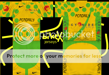
What do you think about it? |
| |
|
|
| lluuiiggii |
Posted on 12-01-2013 21:23
|
Grand Tour Champion
Posts: 8425
Joined: 30-07-2010
PCM$: 200.00
|
The quality of logos is good, but polka dots not so much (they look a bit pixelated)... did you by any chance use the paint bucket tool on the TdF polka dot shirt?
Edited by lluuiiggii on 12-01-2013 21:24
|
| |
|