|
2009 Jerseys
|
| CrueTrue |
Posted on 11-01-2009 19:26
|

Tour de France Champion

Posts: 27880
Joined: 20-10-2006
PCM$: 200.00
|
Still no pictures of the back... |
| |
|
|
| Ad Bot |
Posted on 16-06-2026 16:53
|
Bot Agent
Posts: Countless
Joined: 23.11.09
|
|
| IP: None |
|
|
| CrueTrue |
Posted on 11-01-2009 20:31
|
Tour de France Champion
Posts: 27880
Joined: 20-10-2006
PCM$: 200.00
|
The Austrian Cyclo Cross Championship was ridden today, and it was possible to see Vorarlberg - Corratec's new shirt - does anyone have any pictures? |
| |
|
|
| jimy |
Posted on 11-01-2009 20:40
|
Junior Rider

Posts: 32
Joined: 20-09-2007
PCM$: 200.00
|
rasm wrote:
Katusha is to dark, and I still prefer Sim-erasers Silence, but some good jerseys there 
It is also the jersey, look:
https://www.cycles...usha-0.htm
And the other, depends on taste, the sim is very good, I am beginning |
| |
|
|
| CrueTrue |
Posted on 11-01-2009 20:44
|
Tour de France Champion
Posts: 27880
Joined: 20-10-2006
PCM$: 200.00
|
It's very dark there, that's true, but in he presentation pictures, it wasn't nearly as dark. |
| |
|
|
| jolly_antunes |
Posted on 11-01-2009 20:49
|

Sprinter

Posts: 1855
Joined: 14-08-2007
PCM$: 200.00
|
CrueTrue wrote:
Still no pictures of the back...
Don't cry Crue 

We can't see the whole back, but most of it is there.
|
| |
|
|
| rasm |
Posted on 11-01-2009 21:07
|

Stagiare

Posts: 246
Joined: 30-03-2008
PCM$: 200.00
|
I'm on bettering LAge's and my shirt, perhaps tomorrow with a release. It's a bit confusing thoug with both black and white shorts, but I will go with the white because Rogers was wearing that. See ya! |
| |
|
|
| aavf |
Posted on 12-01-2009 00:38
|

Stagiare
Posts: 151
Joined: 17-09-2007
PCM$: 200.00
|
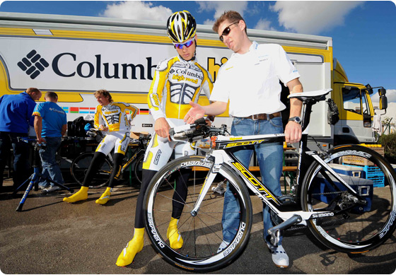
Columbia's jersey back:
https://www.hincapie.com/blogs/kirk_fl...Veloz.aspx
Edited by aavf on 12-01-2009 00:38
|
| |
|
|
| aavf |
Posted on 12-01-2009 00:54
|
Stagiare
Posts: 151
Joined: 17-09-2007
PCM$: 200.00
|
Look at the shoe covers!!! Not good, even worst with black pants. Wishing they don't keep this jersey for long, maybe change for the Tour.
aavf attached the following image:
Edited by aavf on 12-01-2009 00:55
|
| |
|
|
| Macquet |
Posted on 12-01-2009 01:00
|

Domestique

Posts: 639
Joined: 28-09-2007
PCM$: 200.00
|
Wow the white shorts hurt my eyes...At least the black shorts didn't make them look like they were riding in their underwear.
The jersey is not so bad but the white shorts are terrible... |
| |
|
|
| CrueTrue |
Posted on 12-01-2009 01:01
|
Tour de France Champion
Posts: 27880
Joined: 20-10-2006
PCM$: 200.00
|
It's crazy. How did it end up that bad?
The bike is quite good looking, though. |
| |
|
|
| Deadpool |
Posted on 12-01-2009 01:29
|
Team Leader

Posts: 6727
Joined: 06-10-2007
PCM$: 200.00
|
CrueTrue wrote:
The bike is quite good looking, though.
Yeah, for a Scott  |
| |
|
|
| Deadpool |
Posted on 12-01-2009 01:30
|
Team Leader
Posts: 6727
Joined: 06-10-2007
PCM$: 200.00
|
aavf wrote:
Look at the shoe covers!!! Not good, even worst with black pants. Wishing they don't keep this jersey for long, maybe change for the Tour.
They should, I always hate it when teams ride with a yellow jersey in the tour, it takes away from the prestige of the yellow, and of being the only guy in the pack wearing that color. |
| |
|
|
| baia |
Posted on 12-01-2009 02:13
|

Grand Tour Specialist
Posts: 5377
Joined: 04-10-2007
PCM$: 200.00
|
Deadpool wrote:
aavf wrote:
Look at the shoe covers!!! Not good, even worst with black pants. Wishing they don't keep this jersey for long, maybe change for the Tour.
They should, I always hate it when teams ride with a yellow jersey in the tour, it takes away from the prestige of the yellow, and of being the only guy in the pack wearing that color.
I agree 100% |
| |
|
|
| Gustavovskiy |
Posted on 12-01-2009 07:36
|

Team Leader
Posts: 6272
Joined: 20-07-2008
PCM$: 200.00
|
this thread seemed to have become more of a beauty contest 
(just kidding)
|
| |
|
|
| Smoothie |
Posted on 12-01-2009 08:17
|
Team Leader
Posts: 5732
Joined: 04-02-2007
PCM$: 300.00
|
I think at the end of the day it will be a personal choice on the riders part, they seem to have Black and White shorts. Also i remember having morealess the same discussion last year saying the High Road jersey was horrible. Personally i think after a few times of watching it on TV and seeing it win a few things most of you will begin to like it. |
| |
|
|
| mb2612 |
Posted on 12-01-2009 11:10
|
Team Leader
Posts: 5535
Joined: 18-05-2008
PCM$: 200.00
|
Whether we begin to like it or not it will just become their jersey and no one will care what it looks like
 [url=www.pcmdaily.com/forum/viewthread.php?thread_id=33182] Team Santander Media Thread[/url]
Please assume I am joking unless otherwise stated |
| |
|
|
| Smoothie |
Posted on 12-01-2009 11:11
|
Team Leader
Posts: 5732
Joined: 04-02-2007
PCM$: 300.00
|
CrueTrue wrote:
It's very dark there, that's true, but in he presentation pictures, it wasn't nearly as dark.
One word - Replica |
| |
|
|
| fenian_1234 |
Posted on 12-01-2009 13:11
|

Grand Tour Specialist
Posts: 4726
Joined: 06-12-2006
PCM$: 200.00
|
I've gone the other way, smoothie.
Kind of liked it when I first saw it, but just gets worse and worse now every time I see it.... |
| |
|
|
| Thrige |
Posted on 12-01-2009 14:35
|
Breakaway Specialist
Posts: 788
Joined: 17-11-2008
PCM$: 200.00
|
Go Linda Villumsen xD |
| |
|
|
| rasm |
Posted on 12-01-2009 15:13
|
Stagiare
Posts: 246
Joined: 30-03-2008
PCM$: 200.00
|

Please don't point out all the small foults, it's without dobut the hardest jersey I've ever made. In-game the foults almost doesn't show. |
| |
|