|
Fantasy Jerseys in PCM13 format
|
| miggi133 |
Posted on 14-06-2013 23:45
|

Classics Specialist

Posts: 2992
Joined: 19-08-2009
PCM$: 200.00
|
admirschleck wrote:
Omg,shorts is way too empty,omg,noob!
Nice one so far, but must say that i like this version much more:
Its not even my shirt, but cheers... 
|
| |
|
|
| MrUfo87 |
Posted on 14-06-2013 23:46
|

Classics Specialist
Posts: 2767
Joined: 06-01-2012
PCM$: 700.00
|
admirschleck wrote:
Omg,shorts is way too empty,omg,noob!
Nice one so far, but must say that i like this version much more:
I like miggi's one more. This shirt has too many logo's.
|
| |
|
|
| admirschleck |
Posted on 14-06-2013 23:47
|

Team Leader

Posts: 6566
Joined: 11-10-2010
PCM$: 200.00
|
Haha , i just edited comment. Zabel'd (sort of).
Anyway,going to do a jersey now (it's request actually),since school is finished and i have time to clean up request's window!
|
| |
|
|
| miggi133 |
Posted on 14-06-2013 23:50
|
Classics Specialist
Posts: 2992
Joined: 19-08-2009
PCM$: 200.00
|
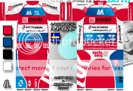
@MrUfo87:
Well, I requested it that way, cause my man-game team is called Gazprom-Rostelekom and I wanted it somewhat clogged looking, cause I wanted it look like a jersey for a small team!
I think, /marc did an awesome job realising my vague ideas!
(I also had him do it, cause I was on a "cerbatical" from jersey making at the time  ) )
@Admir: How could you miss that??? Its not my background, neither have I ever had such a background, and eventhough I am connected to a bunch of countries, I have nothing to do with sweden...
Oh, and my name is, and has always been, miggi133 and not laidbackmarc!!!
(Shame on you for not getting that in first place! )
Edited by miggi133 on 14-06-2013 23:52
|
| |
|
|
| miggi133 |
Posted on 15-06-2013 01:22
|
Classics Specialist
Posts: 2992
Joined: 19-08-2009
PCM$: 200.00
|
Well, here is the Version for the DB Sponsors... Ill publish an alternative (well the version how it should actually look) in my thread later/tomorrow:
 Lukoil Lukoil
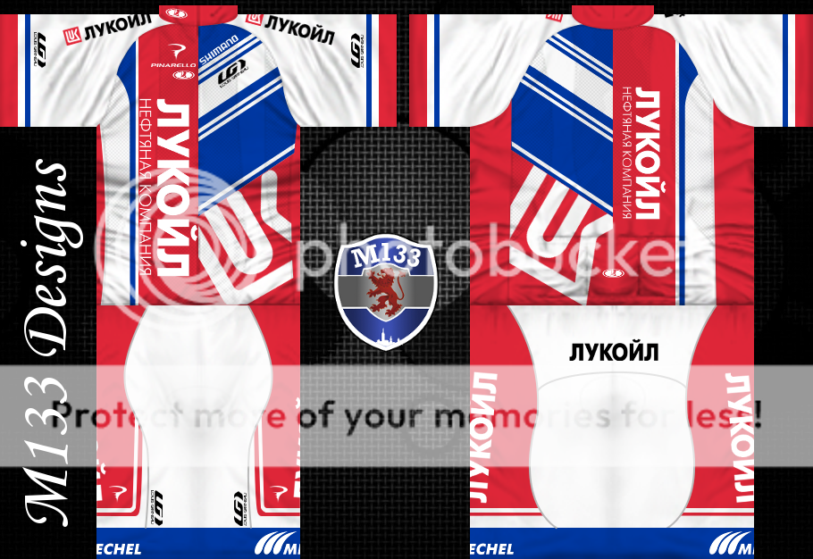
[flag]RU[/flag] [url=https://i1097.photobucket.com/albums/g358/miggi133/LukOil_DB_zps5d89a627.png]LukOil - Miggi133[/url]
Edited by miggi133 on 15-06-2013 01:34
|
| |
|
|
| fcancellara |
Posted on 15-06-2013 01:25
|

Grand Tour Specialist
Posts: 4813
Joined: 18-08-2011
PCM$: 200.00
|
Great design, looks very realistic to me
|
| |
|
|
| Pellizotti2 |
Posted on 15-06-2013 07:55
|

Grand Tour Champion
Posts: 9885
Joined: 01-05-2010
PCM$: 200.00
|
admirschleck wrote:
Omg,shorts is way too empty,omg,noob!
What is with your attitude?
Given that miggi even said "work in progress", you should've been able to figure out that the shorts wouldn't look like that in the final version. No need for insults.
I love the jersey, miggi. Really cool design.
|
| |
|
|
| koningjantje |
Posted on 15-06-2013 10:05
|
Under 23

Posts: 92
Joined: 13-04-2011
PCM$: 200.00
|
haasje33 wrote:
@koningjantje: Nice one. Definitely a candidate for the 2020 database. The german champion trim is placed above the plis instead of beneath it, but that doesn't matter in-game.
Are you going to create more NC jerseys?
EDIT: for the 2020 database it would be nice if you could upload a version without the "Professional Cycling Team" text. This gives us more freedom to place the team in the Continental Tour for example.
I will definitely remove that text, cause I am not really happy about it. I've also planned some major changes to make it better. More NC's will follow but I don't want to make them all the same concept. |
| |
|
|
| Ad Bot |
Posted on 17-06-2026 03:47
|
Bot Agent
Posts: Countless
Joined: 23.11.09
|
|
| IP: None |
|
|
| Jesleyh |
Posted on 15-06-2013 10:09
|
World Champion
Posts: 14744
Joined: 21-07-2012
PCM$: 200.00
|
koningjantje wrote:
haasje33 wrote:
@koningjantje: Nice one. Definitely a candidate for the 2020 database. The german champion trim is placed above the plis instead of beneath it, but that doesn't matter in-game.
Are you going to create more NC jerseys?
EDIT: for the 2020 database it would be nice if you could upload a version without the "Professional Cycling Team" text. This gives us more freedom to place the team in the Continental Tour for example.
I will definitely remove that text, cause I am not really happy about it. I've also planned some major changes to make it better. More NC's will follow but I don't want to make them all the same concept.
Sounds good
Feyenoord(football) and Kelderman fanboy
PCMdaily Awards: 12x nomination, 9x runner-up, 0x win.
|
| |
|
|
| admirschleck |
Posted on 15-06-2013 10:17
|
Team Leader
Posts: 6566
Joined: 11-10-2010
PCM$: 200.00
|
Pellizotti2 wrote:
admirschleck wrote:
Omg,shorts is way too empty,omg,noob!
What is with your attitude?
Given that miggi even said "work in progress", you should've been able to figure out that the shorts wouldn't look like that in the final version. No need for insults.
I love the jersey, miggi. Really cool design.
Hahahahaha!
I posted "omg" twice,used "internet hooligan" vocabulary,and it isn't enough. Wanted to write (JOKE) in "()" , just for someone like you.
Isn't it obvious that i am joking?
Btw,awesome jersey man!
|
| |
|
|
| Pellizotti2 |
Posted on 15-06-2013 10:23
|
Grand Tour Champion
Posts: 9885
Joined: 01-05-2010
PCM$: 200.00
|
Since you've posted similar things without joking earlier, I don't find it that obvious. But sorry for jumping to that conclusion.
Besides, it's always useful to include the  smiley to avoid confusion. Universal sign of sarcasm. smiley to avoid confusion. Universal sign of sarcasm.
|
| |
|
|
| admirschleck |
Posted on 15-06-2013 10:28
|
Team Leader
Posts: 6566
Joined: 11-10-2010
PCM$: 200.00
|
Yeah , i'm sorry that i didn't post it. Will use it in future
|
| |
|
|
| koningjantje |
Posted on 15-06-2013 12:13
|
Under 23
Posts: 92
Joined: 13-04-2011
PCM$: 200.00
|
Castorama - Mercedes-Benz   By Koningjantje By Koningjantje
New Version. I made some major changes. What do you think? Better or worse?
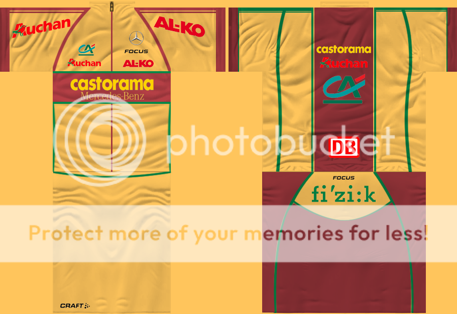
Edited by koningjantje on 15-06-2013 16:59
|
| |
|
|
| arnomoto |
Posted on 15-06-2013 12:16
|

Free Agent

Posts: 137
Joined: 24-01-2009
PCM$: 200.00
|
 Emirates - Arnomoto Emirates - Arnomoto

Edited by arnomoto on 15-06-2013 16:32
|
| |
|
|
| MrUfo87 |
Posted on 15-06-2013 12:18
|
Classics Specialist
Posts: 2767
Joined: 06-01-2012
PCM$: 700.00
|
@koningjantje: I think it's better that now you've deleted Mercedes at the back. I prefer the front of the other version, but the back of this version. But I don't like the green lines, so I should change it into another colour.
EDIT: In the database viewer it's looking good, also the green lines.
Edited by MrUfo87 on 15-06-2013 12:23
|
| |
|
|
| MrUfo87 |
Posted on 15-06-2013 12:19
|
Classics Specialist
Posts: 2767
Joined: 06-01-2012
PCM$: 700.00
|
@arnomoto: Nice jersey!
|
| |
|
|
| Cavendish-Fan |
Posted on 15-06-2013 12:25
|

Domestique

Posts: 510
Joined: 20-09-2007
PCM$: 200.00
|
Try to post it with the link for the code in post 1 and please look at the list before you start we don't want to see a lot of doubles
Edited by Cavendish-Fan on 15-06-2013 12:25
|
| |
|
|
| krisa |
Posted on 15-06-2013 15:19
|

Classics Specialist
Posts: 3892
Joined: 12-04-2011
PCM$: 200.00
|
miggi133 wrote:
Damn you Krisa! I was working on a LukOil shirt myself (mostly by converting one of my old jerseys, which I wasnt really happy with).... Sorry I just don't knew it
|
| |
|
|
| koningjantje |
Posted on 15-06-2013 18:25
|
Under 23
Posts: 92
Joined: 13-04-2011
PCM$: 200.00
|
I haven't seen any youth teams so far, is it ok I design a jersey for one? |
| |
|
|
| FroomeDog99 |
Posted on 15-06-2013 18:58
|

Grand Tour Specialist
Posts: 4461
Joined: 07-10-2012
PCM$: 200.00
|
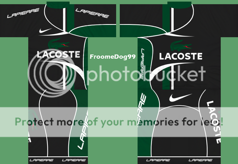
Lacoste
|
| |
|