|
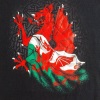
Krisa Graphics 2013| Banner
|
| krisa |
Posted on 09-11-2013 14:55
|

Classics Specialist

Posts: 3892
Joined: 12-04-2011
PCM$: 200.00
|
thanks
|
| |
|
|
| fronaldo |
Posted on 10-11-2013 08:20
|

Neo-Pro

Posts: 347
Joined: 08-09-2013
PCM$: 200.00
|
Nice..do u will make NC and GT jersey also? |
| |
|
|
| krisa |
Posted on 27-11-2013 20:32
|
Classics Specialist
Posts: 3892
Joined: 12-04-2011
PCM$: 200.00
|
 |
| |
|
|
| sutty68 |
Posted on 27-11-2013 23:52
|
Tour de France Champion

Posts: 34002
Joined: 22-08-2010
PCM$: 200.00
|
Looks good mate  |
| |
|
|
| Ad Bot |
Posted on 13-06-2026 18:21
|
Bot Agent
Posts: Countless
Joined: 23.11.09
|
|
| IP: None |
|
|
| krisa |
Posted on 28-11-2013 20:03
|
Classics Specialist
Posts: 3892
Joined: 12-04-2011
PCM$: 200.00
|
 |
| |
|
|
| Jesleyh |
Posted on 28-11-2013 20:17
|
World Champion

Posts: 14744
Joined: 21-07-2012
PCM$: 200.00
|
Making those jerseys for a cyclo-DB(not sure if someone has plans for that), or just because you feel like making them
Feyenoord(football) and Kelderman fanboy
PCMdaily Awards: 12x nomination, 9x runner-up, 0x win.
|
| |
|
|
| krisa |
Posted on 01-12-2013 20:12
|
Classics Specialist
Posts: 3892
Joined: 12-04-2011
PCM$: 200.00
|
 |
| |
|
|
| krisa |
Posted on 01-12-2013 20:13
|
Classics Specialist
Posts: 3892
Joined: 12-04-2011
PCM$: 200.00
|
Update
 |
| |
|
|
| sutty68 |
Posted on 02-12-2013 00:08
|
Tour de France Champion
Posts: 34002
Joined: 22-08-2010
PCM$: 200.00
|
Personally i would have liked to see a bit more orange being used since it has Easy Jet as a sponsor |
| |
|
|
| krisa |
Posted on 05-12-2013 11:30
|
Classics Specialist
Posts: 3892
Joined: 12-04-2011
PCM$: 200.00
|
Update
 |
| |
|
|
| sutty68 |
Posted on 05-12-2013 15:39
|
Tour de France Champion
Posts: 34002
Joined: 22-08-2010
PCM$: 200.00
|
That looks better |
| |
|
|
| krisa |
Posted on 05-12-2013 15:52
|
Classics Specialist
Posts: 3892
Joined: 12-04-2011
PCM$: 200.00
|
thanks |
| |
|
|
| krisa |
Posted on 09-12-2013 10:16
|
Classics Specialist
Posts: 3892
Joined: 12-04-2011
PCM$: 200.00
|
 |
| |
|
|
| krisa |
Posted on 14-12-2013 17:03
|
Classics Specialist
Posts: 3892
Joined: 12-04-2011
PCM$: 200.00
|
If you want to start a career with MTN feel free to use
 |
| |
|
|
| Maddrengen |
Posted on 14-12-2013 17:07
|
Protected Rider
Posts: 1234
Joined: 10-08-2010
PCM$: 200.00
|
It's "One Bicycle at the time"
Edited by Maddrengen on 14-12-2013 17:08
|
| |
|
|
| krisa |
Posted on 14-12-2013 17:09
|
Classics Specialist
Posts: 3892
Joined: 12-04-2011
PCM$: 200.00
|
Damn |
| |
|
|
| krisa |
Posted on 14-12-2013 17:20
|
Classics Specialist
Posts: 3892
Joined: 12-04-2011
PCM$: 200.00
|
 |
| |
|
|
| Maddrengen |
Posted on 14-12-2013 17:31
|
Protected Rider
Posts: 1234
Joined: 10-08-2010
PCM$: 200.00
|
Forgive me, for not noticing before, but i think Castilli writing should be black, and the trek logo should be darker. And it's outdated too, this is the new logo:

And for the writing, i would write it like this: "Mobilising Change In Africa One Bicycle At A Time" or Mobilising change in Africa one bicycle at a time" (diifference is the big letters )
Edited by Maddrengen on 14-12-2013 17:35
|
| |
|
|
| krisa |
Posted on 14-12-2013 17:38
|
Classics Specialist
Posts: 3892
Joined: 12-04-2011
PCM$: 200.00
|
https://www.teammtnqhubeka.com/ the letters are like here |
| |
|
|
| Maddrengen |
Posted on 14-12-2013 17:51
|
Protected Rider
Posts: 1234
Joined: 10-08-2010
PCM$: 200.00
|
No it ain't. Reason i noticed it was the big "A". It's an adverb (i think), why it looks silly it's big. And it's not big in the MTN page neither
|
| |
|